TIMELINE
May 2023 - Jun 2023
Type
Mobile Application Case Study
responsıbılıtıes
I conducted benchmarking to analyze competitors and uncover design opportunities. I developed the brand identity, defined UX workflows through research and wireframes, and delivered high-fidelity UI designs to ensure a cohesive and user-focused experience.
GOAL
To design an intuitive and privacy-focused digital platform that empowers women to track their menstrual cycles, sexual activity, and related symptoms—enabling them to better understand their bodies and make informed decisions about their reproductive and overall health.
outcome
Prototype testing validated the need for a private and intuitive tool to track menstrual cycles and sexual activity. Users appreciated the clarity the app brought to their health patterns and found the design simple, discreet, and easy to use.
Overview
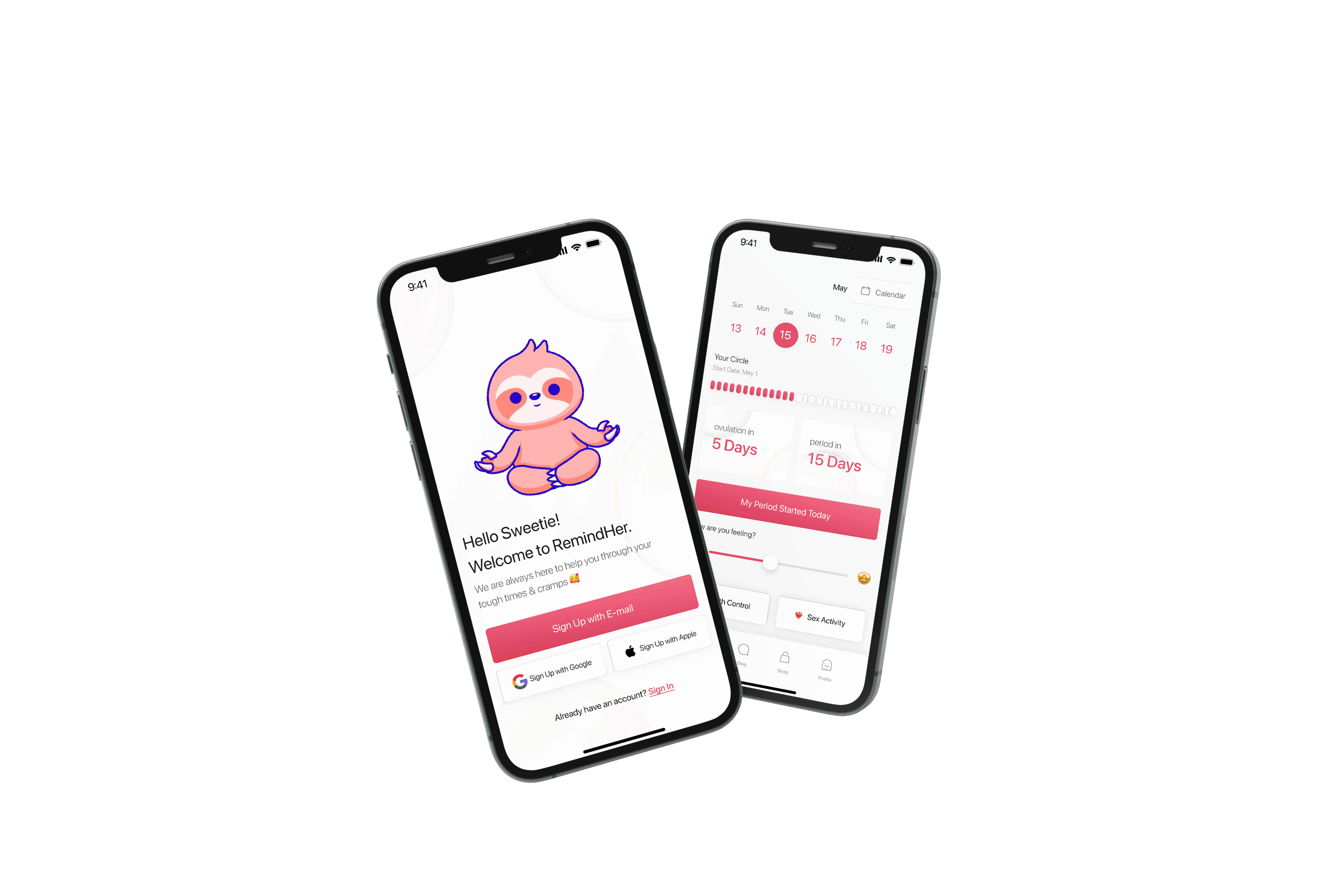
Creating a mobile app tailored to women, providing personalized features for tracking menstrual cycles, symptoms, fertility, and health insights.
Multiple activities
Tracking menstrual cycles, monitoring birth control pill usage, logging sex activities, exploring informative blogs, and conveniently shopping for their health and wellness essentials.
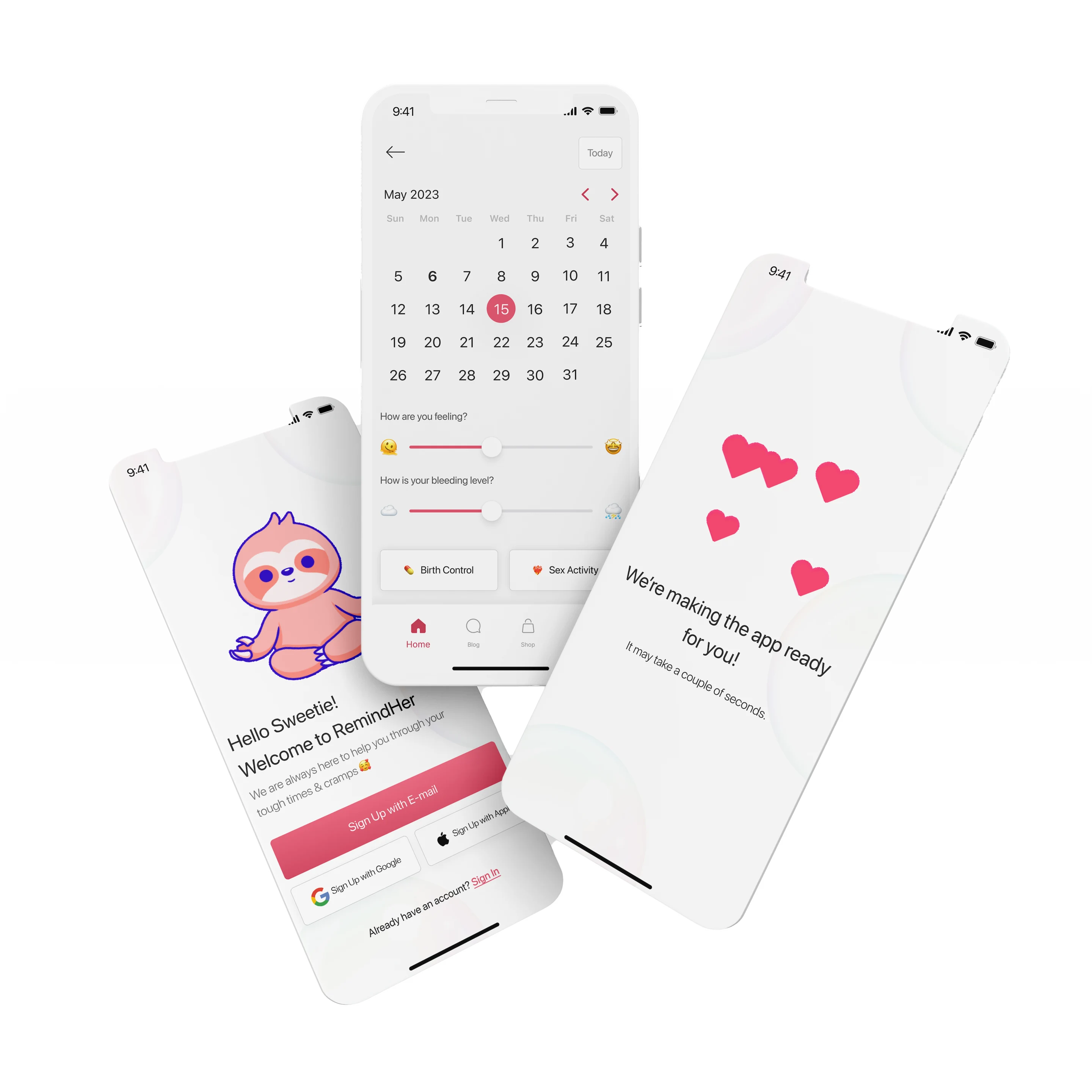
Easy-to-use
Users can effortlessly input information such as start and end dates, flow intensity, and symptoms, while the app's intelligent algorithms provide valuable insights into individual cycle patterns.
For women, encompassing all aspects
Including an informative blog section that covers a wide range of topics related to reproductive health, self-care, wellness tips, and lifestyle inspiration. The app aims to serve as a trusted resource, offering expert advice and empowering women to make informed decisions about their health and well-being.
How can we create
a private and empowering experience for tracking menstrual cycles and sexual activity

challenges
Creating an all-in-one app to become the new BFF for women worldwide.
Striking the Right Balance
Designing an app with multiple features like period tracking, pill monitoring, activity logging, blog, and shopping required finding a balance between complexity and simplicity, ensuring a user-friendly experience.
Inclusivity and Sensitivity
Creating an inclusive and sensitive app for women's health involved considering diverse user backgrounds and identities, conducting research, and incorporating feedback to ensure the app resonates with all users.
Streamlining User Experience
Creating a seamless and intuitive user experience was a challenge throughout the design process. Balancing multiple features, optimizing navigation, and ensuring a cohesive and enjoyable journey required careful consideration to streamline the overall user experience and enhance usability.
personas
Introducing the personas.
With the user & market analysis, I came up with two potential user groups.

Amy Adams
Main Statement
''I hate getting my period. It always seems to happen at the most unexpected times''
Age
17
Profession
Student
About
Amy, a high school student, often finds herself spending a lot of time in the doctor's office due to her health problems, and she uses birth control pills.
Goals
To be a doctor to help people.
Graduate high school.
Frustrations & Painpoints
Getting her period unexpectedly and being unprepared.
Waking up early.

Ashley Black
Main Statement
"You always have to be prepared!"
Age
30
Profession
Fashion Designer
About
Ashley is a fashion designer employed at a renowned company. Her time is primarily dedicated to her work in the office, but during her leisure hours, she enjoys socializing, meeting new people, and exploring the outdoors.
Goals
Being the number one fashion designer in the world.
Open her store.
Being healthy.
Frustrations & Painpoints
A day only has 24 hours.
Never getting enough sleep.
desıgn decisions
Following the research and the brand guideline I created a new UI for the app.
On each page, brand guidelines, color options, and the creation of a sincere feeling have been carefully considered.
A friendly concept.
Navigation is straightforward, focusing on a simple calendar view for tracking cycles. I've added some customization options, but nothing too fancy, just enough to suit personal preferences. Accessibility features ensure inclusivity, and I've kept the onboarding process friendly and feedback open for improvements. My goal is to offer a straightforward, helpful tool for women everywhere.
Font decisions.
I incorporated SF Pro Display font throughout the entire app to enhance readability and ensure a consistent visual experience for users. This font choice was specifically selected for its clean and modern appearance, which aligns with the app's design aesthetics.
Color palette.
Primary color
Aphrodisiac
Why? Pink is associated with femininity, warmth, and positive emotions. It can create a welcoming and calming atmosphere, while also promoting empowerment and confidence. However, it's important to consider individual and cultural variations in color preferences.
secondary color
Raspberry Mousse
prımary text color
Carbon Fiber
secondary text color
Paris Paving
tertiary text color
Lighthouse