Mobile App UX Design
customer
TIMELINE
February 2022 -
November 2022
Type
Mobile App UX Design
responsıbılıtıes
Designed the Prosumer mobile app as the sole UX/UI designer, creating user flows and interfaces for customers and field workers to track energy production and consumption. Conducted user research to ensure clarity and usability across devices.
GOAL
To create a simple, efficient, and user-friendly mobile app that enables customers and field workers to easily track and monitor their energy production and consumption in real time.
outcome
The Prosumer app launched successfully with positive feedback from both end-users and internal teams. Its clear interface and tailored user journeys improved data visibility and operational efficiency, helping users stay informed and in control of their energy usage.
How can we provide
easy-to-use multi-tenant energy management and monitoring solutions for use on the go.
users
Prosumer targets a niche audience comprising educated field workers and administrative professionals.
Educated field workers
For managing and tracking energy production and consumption, as well as detecting errors earlier, field workers use the Prosumer app.
Administrative quarter
To track profits and income, as well as manage energy rates effectively.
Intervıews
We conducted as much research as possible within the limited target group.
Live data synchronization.
After discussing with the user, it became apparent that having live data is crucial for utilizing our app effectively, allowing them to identify any errors promptly.
Importance of being easy to use.
Most users indicate that they will be using the app during other activities such as field trips or system implementations, making it crucial to be able to use the app with one hand.
Clear notifications and indicators.
Like the previous statement, they want to receive notifications and see each action as soon as they open the app without clicking additional buttons.
Busıness metrıcs
We consider those three metrics during our design, development, and testing processes.
Daily active users
Frequency and consistency of user interactions within our app daily.
User Retention Rate
Users who continue to use our service on a monthly basis.
Customer Lifetime Value
The total net profit we are expected to generate over their entire relationship with a company.
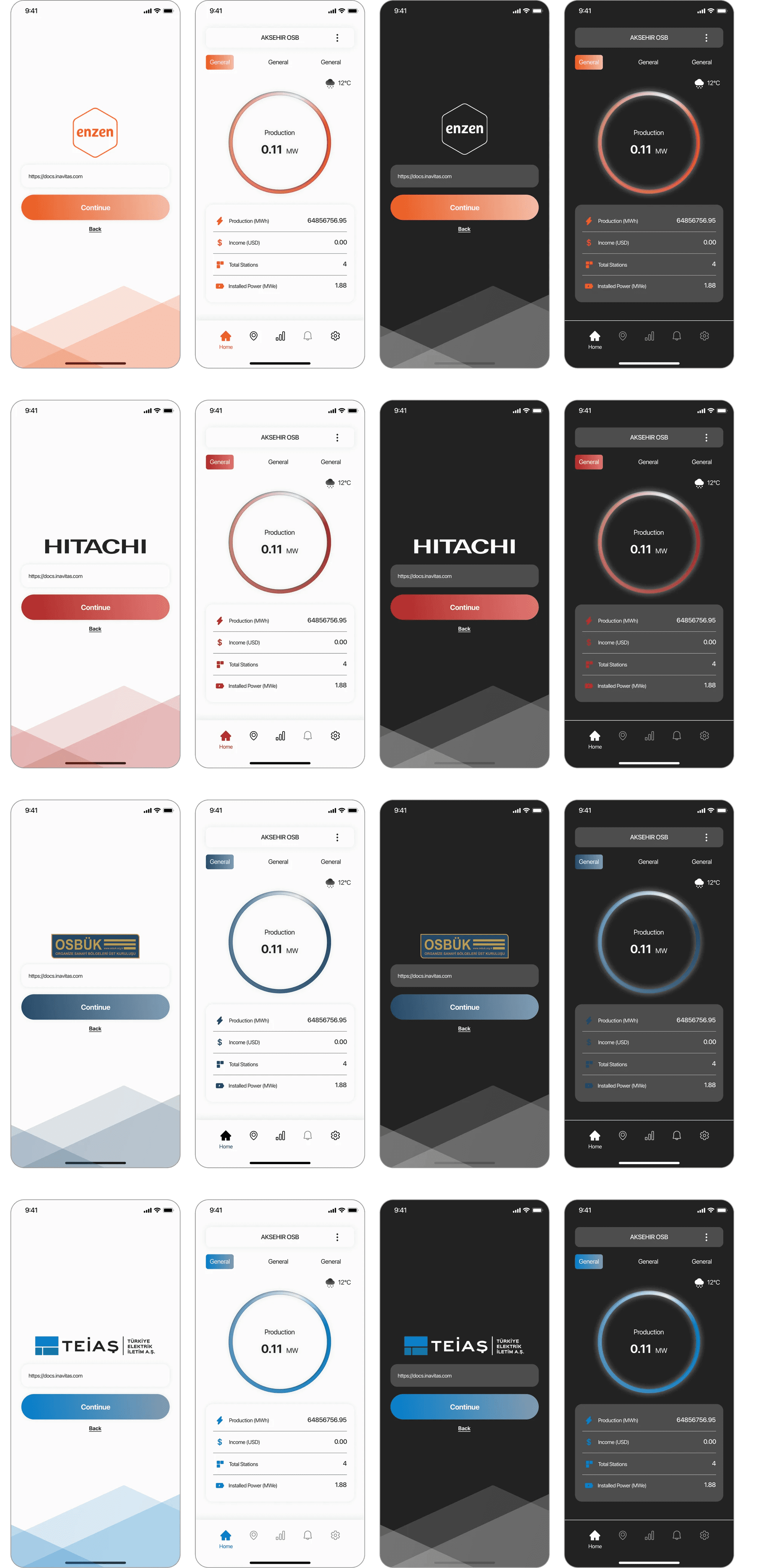
desıgn decisions
Following the research and the brand guideline I created a new UI for the app.
On each page, brand guidelines, color options, and the ease of use have been considered.
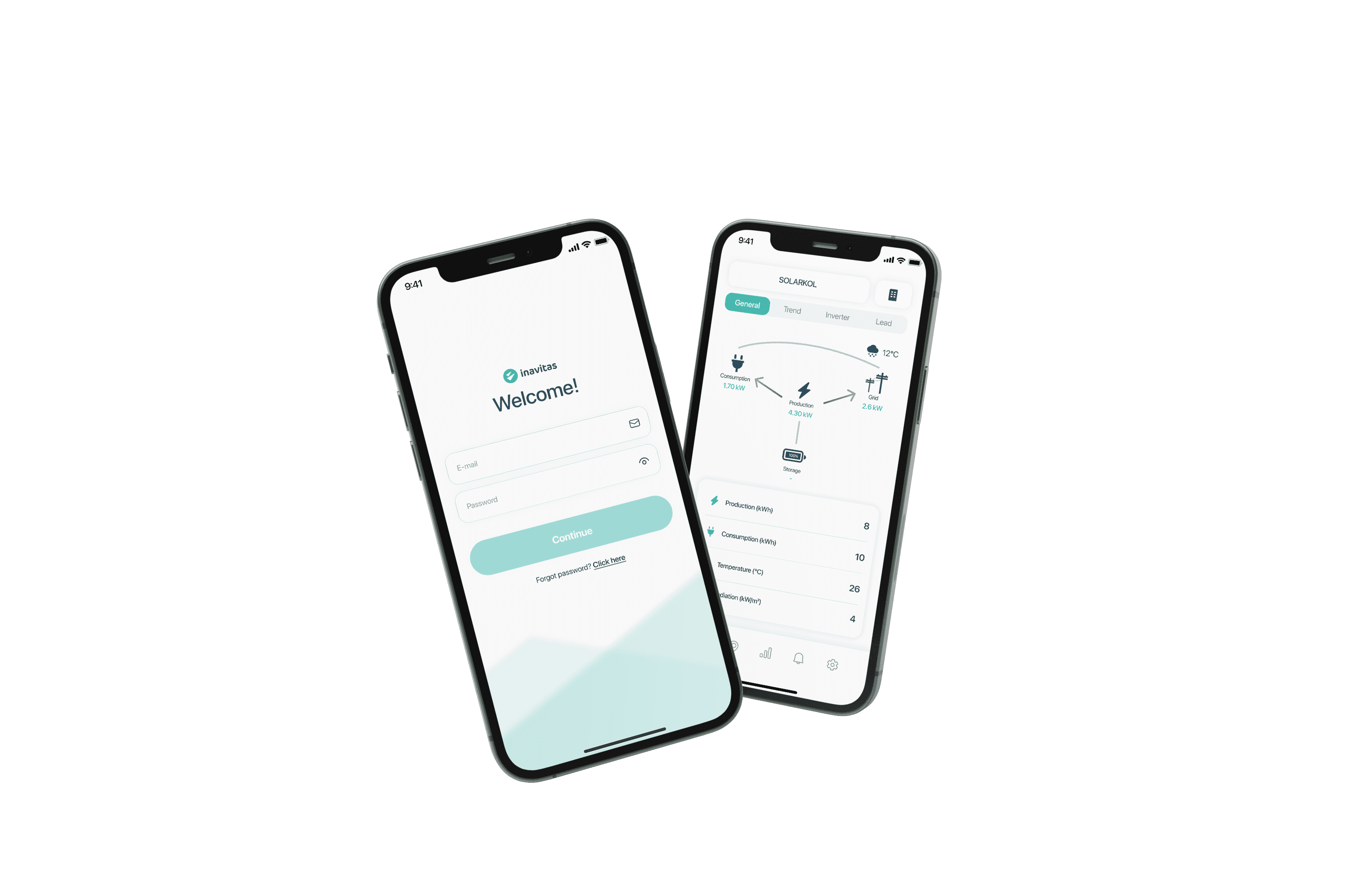
Clean and accessible UI.
Based on the feedback we've gathered, I aimed to incorporate only the necessary elements on the screen, utilizing universal colors and ensuring high contrast ratios.
Data demonstrations.
Due to the nature of this app, which heavily relies on charts and tables, I made an effort to keep them as large as possible so that users can grasp the data at a glance.
A modern and lightweight app.
The existing app for this is outdated and difficult to use, so the customer requested a more modern look. To achieve this, I incorporated glass morphism and light shadows.
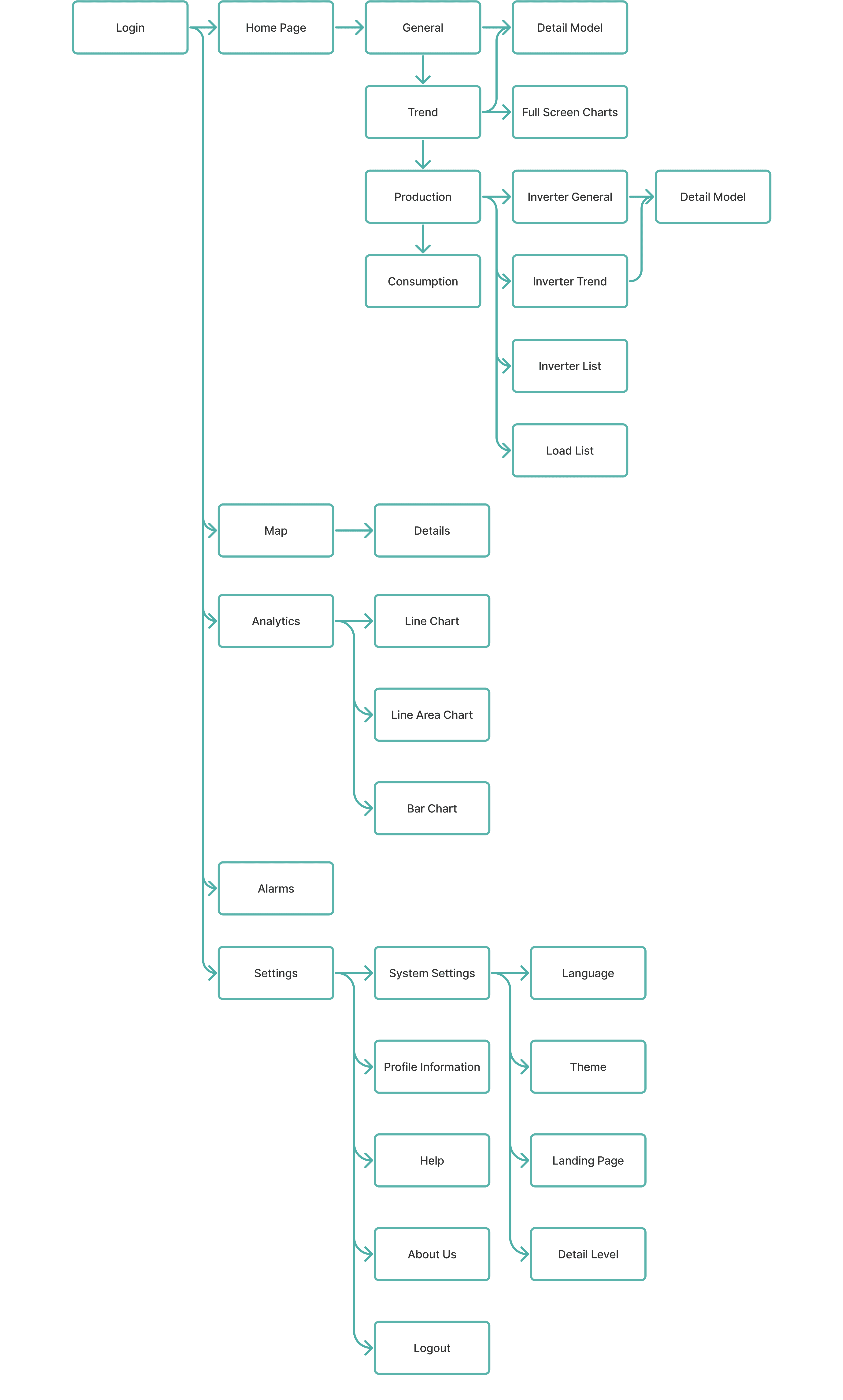
USER FLOW
TENANT ADAPTATION