Dashboard UX Design
customer
TIMELINE
February 2022 -
November 2022
Type
Web Dashboard Design
responsıbılıtıes
I was responsible for designing an intuitive and efficient dashboard tailored to the needs of plant operators and energy managers. I conducted user research, created wireframes and interactive prototypes, and collaborated closely with product managers and developers.
GOAL
The goal was to improve the clarity, accessibility, and usability of the dashboard to help users monitor real-time energy performance, detect faults quickly, and optimize plant efficiency. I aimed to reduce cognitive load and enhance task flow for core actions like anomaly detection and reporting.
outcome
The redesign improved user satisfaction and made it easier for operators to monitor energy performance and identify issues quickly, resulting in faster decision-making and more efficient plant management.
Overview
Redesigning and improving Inavitas' Plant website for energy and plant monitoring.
Live data synchronization
After discussing with the user, it became apparent that having live data is crucial for utilizing our app effectively, allowing them to identify any errors promptly.
Clear notifications and indicators
The users want to receive notifications and see each action as soon as they open the app without clicking additional buttons.
users
Plant targets a niche audience comprising educated field workers and administrative professionals.
Educated field workers.
For managing and tracking energy production and consumption, as well as detecting errors earlier, field workers use the Prosumer app.
Administrative quarter.
To track profits and income, as well as manage energy rates effectively.
challenges
It is always hard to detect the exact needs and conduct interviews with such a niche user group.
Everything at once
As this is a monitoring website, users expect to be able to view all the important data at first glance, which can lead to data pollution in the UI.
Small and niche target group
The small size of the user group who are technically informed about energy management systems. This limitation complicates the process of gathering diverse user feedback and insights, potentially leading to gaps in understanding the broader spectrum of user needs and preferences
Requiring knowledge about the field
Energy monitoring isn't an area encountered in everyday life. Therefore, before embarking on interface design and creation, one should possess a certain amount of information.
desıgn system creatıon
After analyzing the existing apps, the need for a common language arises.
Consistency.
In my role as the UX/UI designer for Inavitas, I led the creation of a comprehensive design system aimed at establishing consistency across web and mobile platforms
Brand-product alignment.
By carefully aligning our color palette with the brand identity, I ensured visual harmony while maintaining a cohesive user experience. The design system serves as a foundational element for development, enabling efficient iteration and ensuring that our digital presence remains user-friendly and aligned with Inavitas' brand image.
Scalability.
Given that Inavitas offers various products accessible on mobile phones, tablets, and computers, the system was designed responsively to adapt to all applications
A scalable system of user interface elements and designs, guaranteeing a uniform user experience across various platforms.
Project hıghlıghts
Harmony with the brand identity.
I selected fonts and statement colors that align with the main color of the brand across all applications. This consistent approach ensures that the brand's identity is reflected uniformly. The fonts were chosen to convey professionalism and coherence, while the statement color serves to highlight crucial elements within the interface. With this integration, I establish a visual language that reinforces the brand's identity.
Adding micro-interactions.
Adding microinteractions to components like buttons, dropdowns, and stickers enhances user engagement while keeping the interface clean and minimal. These small animations and feedback mechanisms provide immediate responses to user actions. For example dropdowns with smooth transitions or stickers that subtly animate upon selection add dynamism and engagement without cluttering the interface so much.
Custom icon designs.
In developing the design system, I made sure to choose icons and labels that are universally understood. This enhances accessibility for all users. Each icon was selected for its clarity and ability to represent specific actions or functions clearly. By using familiar symbols and straightforward labels, I aimed to make the interface easy to understand and navigate for everyone, regardless of their experience with the platform
Adaptation across platforms.
The system is designed to work smoothly across different platforms, such as websites and mobile apps. By keeping components, layouts, and visual elements consistent, users get a unified interface regardless of the device they're using. This means they can switch between platforms seamlessly without encountering confusing differences in design or how things work. Users can expect the same easy-to-use experience.

desıgn decisions
Following the brand guideline I created a new UI for the app.
Accessibility for all.
Incorporating principles of inclusive design from the outset allows for a more seamless and equitable user experience. By prioritizing accessibility features such as high contrast interfaces, adjustable font sizes, and keyboard navigation options, I aim to ensure that the Inavitas Energy Management System is usable and beneficial to a wide range of users.
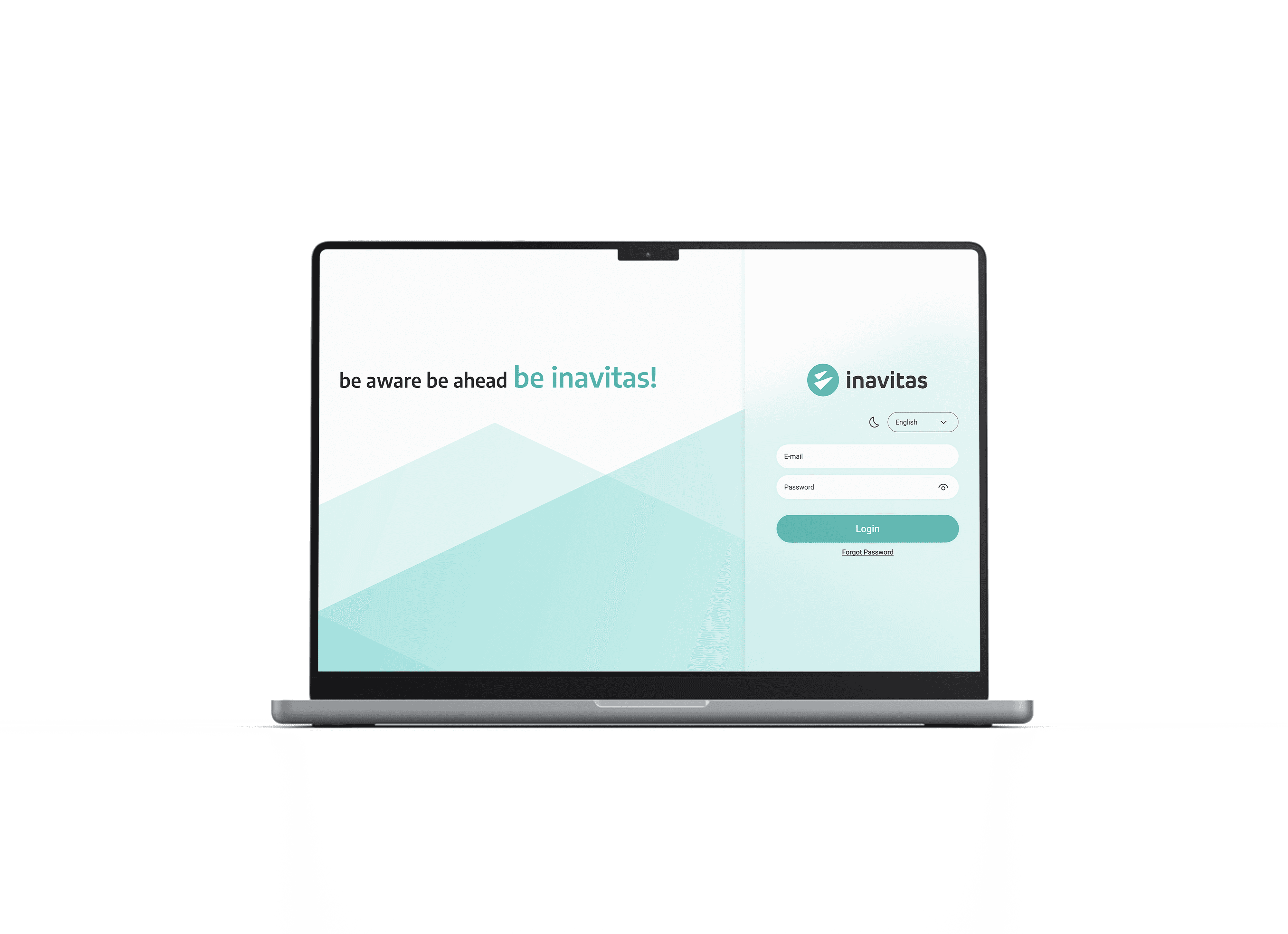
A sleek UI design that communicates innovation
I incorporated SF Pro Display font throughout the entire app to enhance readability and ensure a consistent visual experience for users. This font choice was specifically selected for its clean and modern appearance, which aligns with the app's design aesthetics.
Crafting a design system.
The design system will encompass standardized UI components, typography, color schemes, and interaction patterns, providing a unified framework for the development of all applications within the ecosystem.
Color palette.
Primary color
Turquoise Fantasies
Why? Because I want to integrate the brand's identity as much as possible.
secondary color
Seven Seas
Why? Because the brand needed a darker color to be used in dark mode and primary texts.
prımary text color
Seven Seas
secondary text color
Brilliance