
COMPANY
TIMELINE
November 2023 - March 2024
Type
B2B Web Platform & Dashboard
responsıbılıtıes
As a freelance UX/UI designer, I handled benchmarking, UI and interaction design, and led usability testing. I worked closely with a cross-functional team to deliver a user-centered product.
GOAL
Redesign the company’s web app to support a multi-tenant architecture and streamline the process of getting quotes from multiple brands. A key focus is improving accessibility to ensure an inclusive and user-friendly experience for all users.
outcome
Delivered a redesigned web app that simplified quote comparison across brands and supported multi-tenant use. The improved UI and accessibility enhancements led to smoother user interactions and better alignment with business needs.
target user groups
Bermuda has a specific user group that includes young adults, adults, and elderly individuals from various professions.
Car Owners - Seeking for insurance
Individuals who own or lease vehicles and need insurance coverage to protect themselves and their vehicles against potential risks such as accidents, theft, or damage.
Home Owners - Seeking for insurance
Individuals who own or rent residential properties and require insurance coverage to protect their homes and belongings from risks like natural disasters, theft, or liability claims.
Individuals seeking life insurance.
People seeking insurance coverage for various aspects of their lives, such as health, travel, or personal belongings, who may not fit neatly into the categories of car or homeowners. They seek tailored insurance solutions to meet their specific needs and circumstances.
How can we provide
a website which looks fresh and remains consistent across different devices and platforms.

MARKET ANALYSIS
There are a lot of companies doing the same job in the market. To be precise, I chose two well-known ones for the target markets.
The Zebra
Market - Usa
Pros
Simple and Intuitive Interface: The Zebra's website features a clean and intuitive design.
Easy-to-Use Quote Tool: The website offers a user-friendly quote tool that allows visitors to quickly compare insurance rates from multiple providers.
Helpful Resources: The Zebra provides informative articles, guides, and frequently asked questions (FAQs) to help users understand auto insurance terms, coverage options, and purchasing processes.
Mobile Optimization: The website is optimized for mobile devices, ensuring a seamless user experience for visitors.
CONS
Overwhelming Amount of Information: The website may overwhelm users with too much information, especially during the quote comparison process, potentially leading to decision paralysis.
Limited Customization Options: While the quote tool offers comparisons from multiple providers, users may find limited customization options for refining their search criteria or filtering results.
Potential for Information Overload: Some users may find the abundance of articles, guides, and resources on the website overwhelming.
Sigortam.net
Market - Turkey
Pros
Clear Navigation: Easy-to-use navigation menus and intuitive layout.
Simple Form Design: Streamlined and user-friendly forms for getting insurance quotes or purchasing policies.
Visual Clarity: Effective use of visuals such as icons, images, and graphics to explain insurance concepts and products.
Responsive Design: Ensuring the website is optimized for various devices.
Personalization: Offering personalized recommendations based on user inputs and preferences.
CONS
Complex Jargon: Overuse of technical or industry-specific terms without explanations.
Lengthy Forms: Too many form fields or a cumbersome data entry process can deter users from completing quote requests or purchases.
Lack of Visual Hierarchy: Poorly organized content and unclear visual hierarchy.
Limited Support Options: Insufficient customer support channels (such as live chat, email, or phone support)
Slow Loading Times: Slow page loading speeds might create frustrations while using the app.
Project Highlights
Brand identity should be seamlessly integrated into the website without overt promotion, ensuring its presence is felt throughout the user experience. The guidelines also prioritize unwavering consistency and seamless adaptability across a multitude of platforms and devices.

Prioritizing a mobile-first approach recognizes the dominance of smartphone usage in obtaining insurance quotes. We prioritize designing for mobile devices, ensuring seamless accessibility and usability across various screen sizes.

Deciding the color variants are important in adapting the website's design to various brands while maintaining visual consistency and brand integrity. We define an adaptive color palette to ensure that the website's aesthetic aligns seamlessly with each brand's identity.
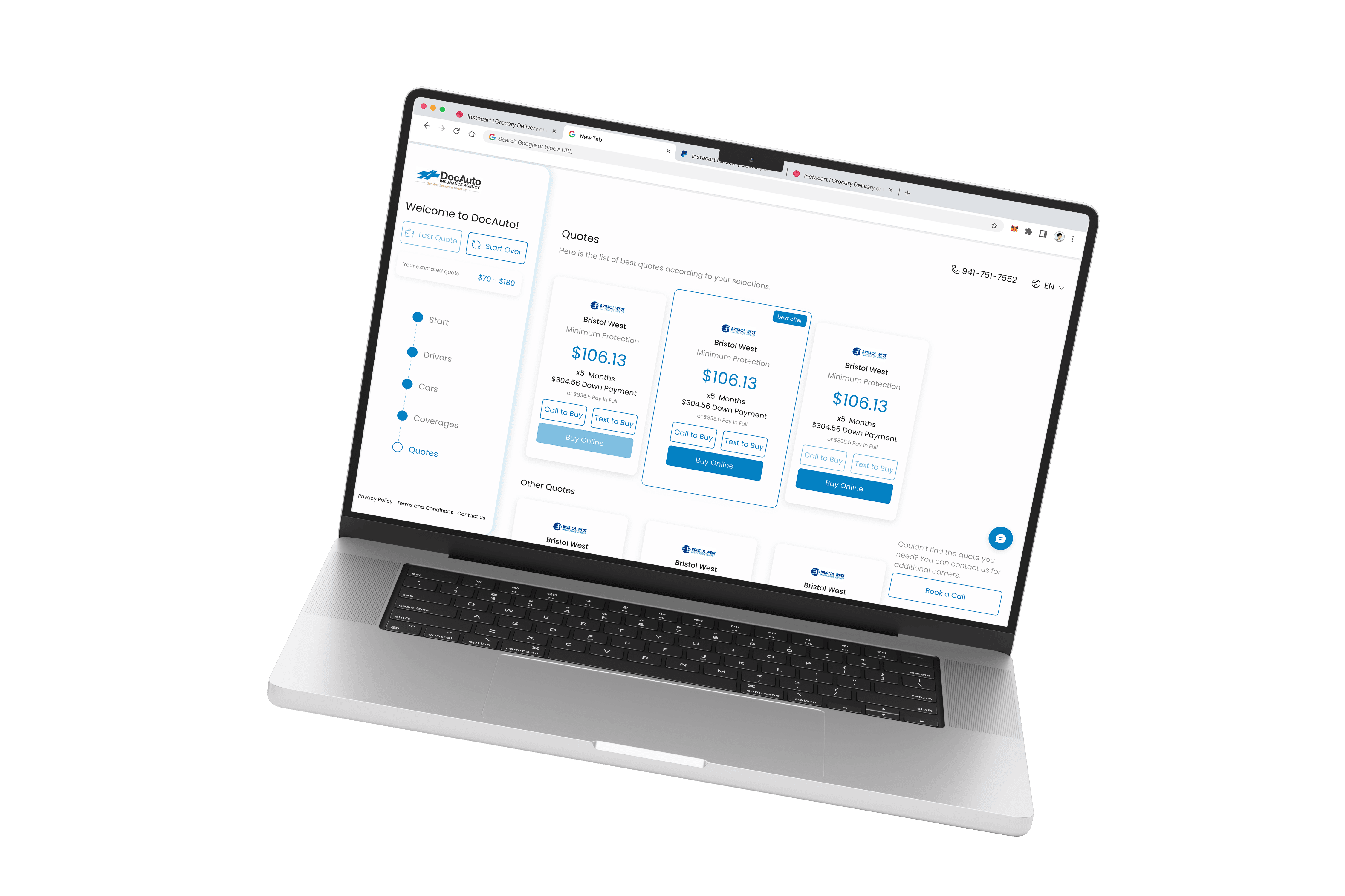
desıgn decısıons
To make the website easy to use, I decided to follow a minimal and clean interface.
Accessibility and readability.
One of the biggest problems that the website had before was the use of low-contrasted colors on top of each other and shiny colors as background colors. Additionally, they had quite small fonts that were almost impossible to read.
Consistent design kit.
On each page, the buttons, input fields, etc., were changing and jumping. By providing clean screen templates and a design kit, I aimed to create consistent page experiences.
Clean interface.
I've kept the design simple with minimal UI elements and small interactions to add a bit of excitement. I chose 'Inter' as the main font and used outlined icons in the app to keep it lightweight.