
COMPANY
TIMELINE
February 2022 -
October 2022
Type
Mobile App Redesign
responsıbılıtıes
Led the mobile app redesign for Beeful, focusing on improving usability and visual consistency. Conducted user research to inform design decisions and refined the brand identity for a cohesive, engaging experience.
GOAL
The goal was to design a digital experience that would streamline the wholesale process, support sustainable practices, and provide a seamless sales tool for marketing and sales professionals.
outcome
The Beeful app redesign launched successfully and is now widely used across Turkey. The improved user experience and consistent branding have boosted user engagement and helped establish Beeful as a trusted nationwide energy service.
Goals
Defining clear goals and finding the market gaps.
After deciding the main use cases for the project, we started to analyze and define the main aims for the first version.
Putting accessibility first.
After conducting a thorough market analysis, the primary observation is that many apps suffer from low readability and difficult-to-navigate interfaces. This poses a significant usability challenge for users, hindering their overall experience
Aligning UI and branding.
An external company developed the MVP of this app without conducting the necessary research or aligning with the branding requirements. This oversight has resulted in a misalignment between the app's functionality, user needs, and the intended brand image.
Iterative approach in development.
During and after the design phase, our focus is on conducting tests and gathering feedback to enhance the user experience iteratively. By actively involving users in the development process, we aim to identify potential pain points, usability issues, and areas for improvement.
personas
After defining the user groups, I created three personas to represent different characteristics

Jessica Brown
Main Statement
‘My phone is my everything, I do not know what I do without it’
Age
19
Profession
University Student
About
Jessica is a student who has been living in Ankara. She is addicted to rock music and joins all the online groups in the social media. She uses her phone for more than 12 hours a day.
Goals
Attending her online meetings without having any errors.
Never miss any of the rock-news
Going to a good college also enables her to travel the world.
Frustrations & Painpoints
Her battery sometimes dies when she is outside with her friends, and she always asks for someone to put her phone on charge.
It is hard to move with a charging cable.

Chad Wilson
Main Statement
‘Bro! Electric cars are definitely the new trends!’
Age
27
Profession
Product Manager
About
Chad is a young product manager in one of the most known design companies in the world. He perceives himself as a trendsetter in his environment. After his promotion, he bought an electric car and now travels around the country with it.
Goals
Impress people as much as possible.
Make more money.
Have a stress-free journey in your stressful life.
Promote sustainability as he believes it is the current trend.
Frustrations & Painpoints
Not enough EV charging stations.
Having frustration.
Learn something long and tedious.

Ashley Adams
Main Statement
‘We have only one world to live in; we need to take care of it!’
Age
23
Profession
Yoga Instructor
About
Ashley is a yoga instructor who promotes sustainability as much as possible. She joins yoga clubs, planting activities, and social responsibility events in her free time. She bikes everywhere. She shares a house with two roommates and two dogs.
Goals
Spread peace all over the world.
Get a healthy life and a healthy future for herself and the environment.
Learn new things every day.
Frustrations & Painpoints
Lots of cars and environmental pollution.
Not enough events to promote sustainability.
Not being able to listen to my podcast on my way.
USER JOURNEY MAPPING
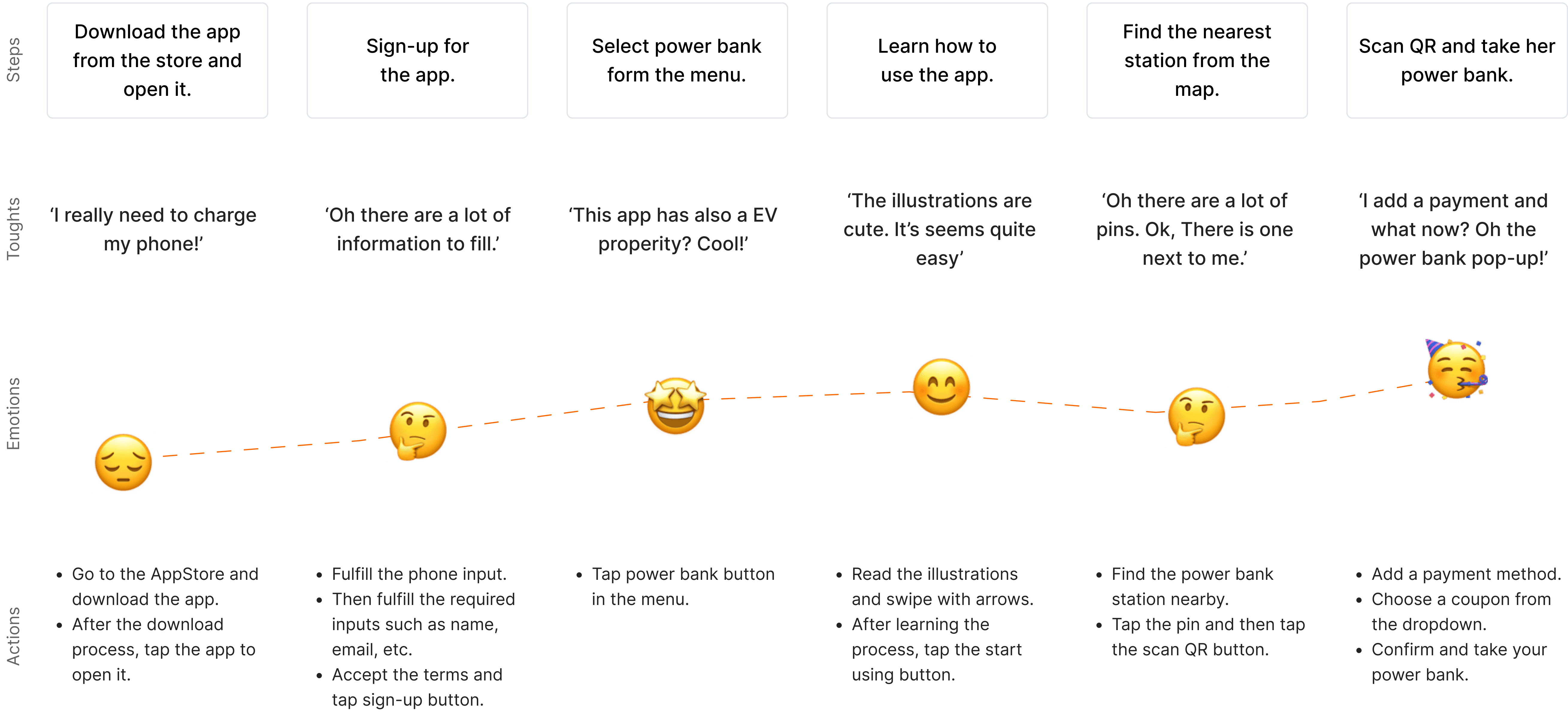
DEFINING THE POTENTIAL USER FLOW

desıgn decisions
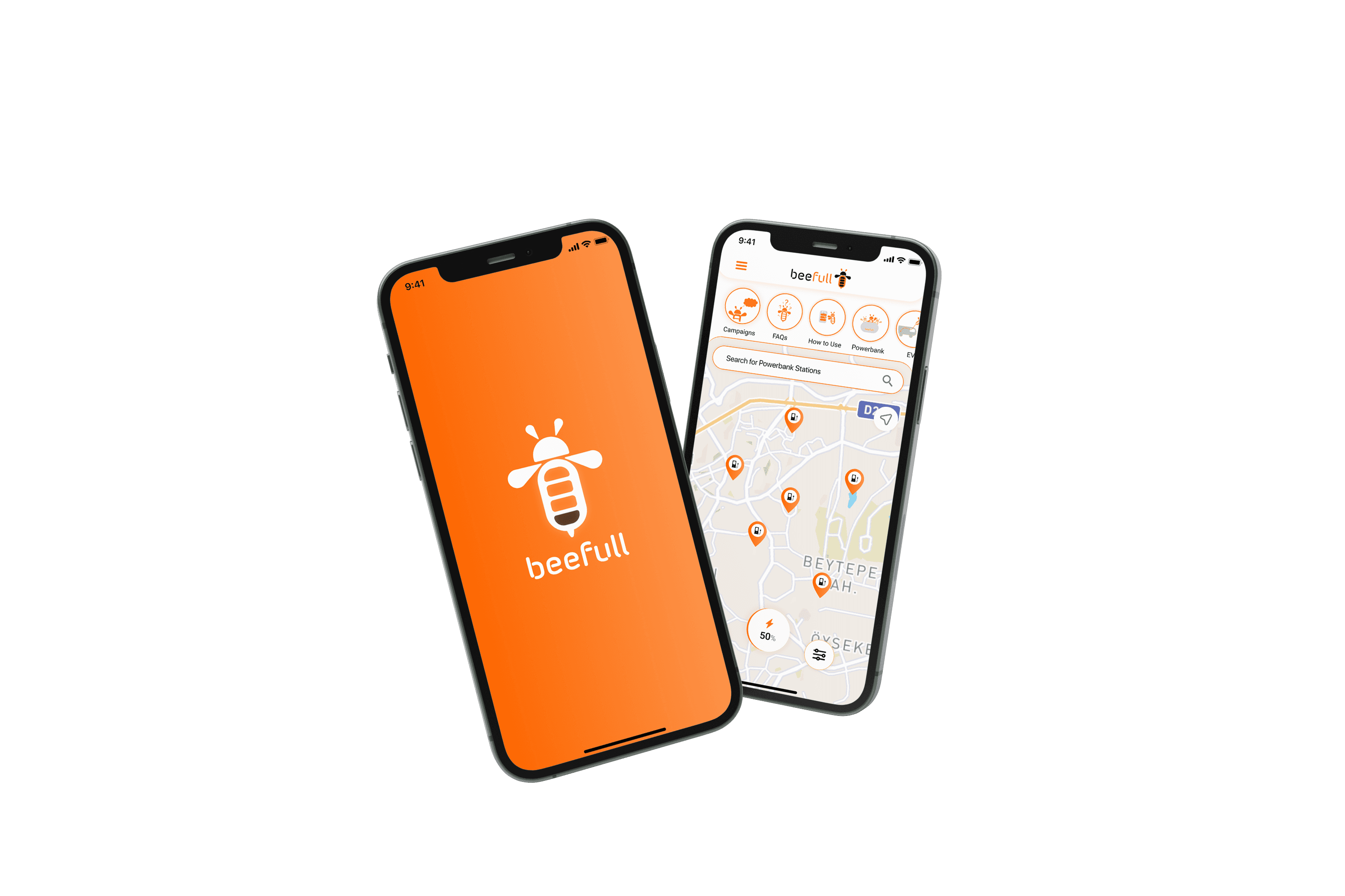
Following the research and the brand guideline I created a new UI for the app.
On each page, brand guidelines, color options, and the dynamic usage of the logo have been considered.
Introduction of the dark theme.
Based on feedback and our branding strategy, I've decided to use orange and black as the main colors for our app.
Defining main colors and font choices.
I've kept the design simple with minimal UI elements and small interactions to add a bit of excitement. For the logo, we're using SF Pro Display, and occasionally using 'Morebi Rounded' adds a playful accent, underscoring our brand's personality.. This approach makes the app visually appealing while maintaining a clear brand identity.
Bringing the 'bee' back.
Since the app's logo lends itself well to creating storylines and marketing content, I utilized it to develop onboarding screens and narratives within the app, prominently featuring the bee motif.